Company
A leading manufacturer of industrial-strength labels also makes specialized printers and design software for their unique materials.
Product
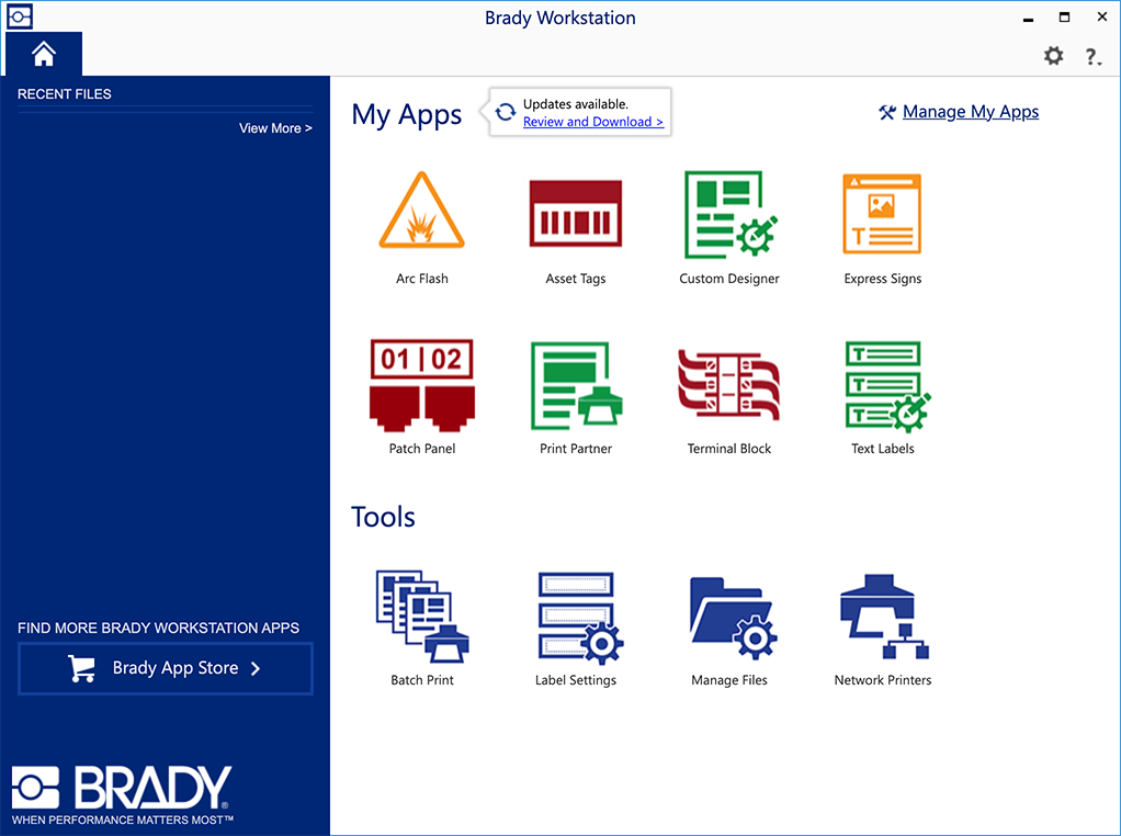
A desktop program for designing labels. Its many modules could be configured to address the needs of different markets and industries.
Ask
Previously, I had worked on enhancements to individual modules. This particular project delivered usability improvements to the core product and its main design interface.
When
September 2019-January 2020 (5 month project)
My Team
 Global Product Manager
 Product Owner
 Lead product designer (me, 6 years of experience)


 Designers
 Tech writer
 Project manager


 Software developers
 Project manager


 Quality assurance testers
Problem 1 – Low metrics opt-in
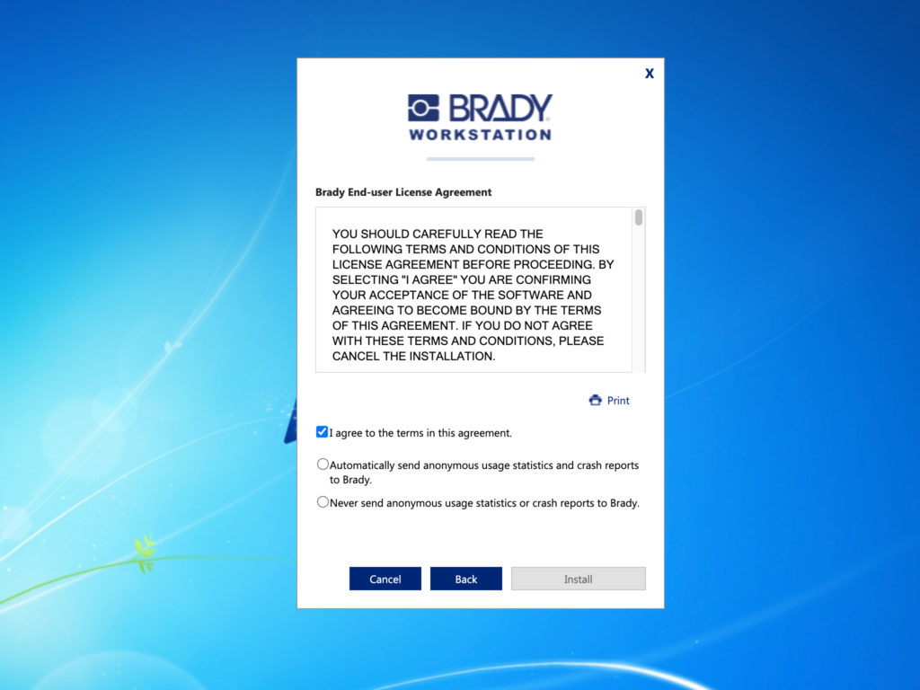
Anonymous statistics and crash reports help developers identify bugs and prioritize improvements. Users must opt-in to this service when installing the software.
- Software was typically installed on standalone computers without internet access.
- Only 3% of known installations opted-in to send performance metrics.
- Legally, users can not send metrics by default (opt-out later).
Risks and Constraints
- Previous user research did not exist.
- End users were unknown because the software was primarily sold through 3rd party vendors.
- Sales people were not responsive to research requests.
User research survey
(1 week) – UserTesting.com
GOAL: Understand how users feel about performance metrics.
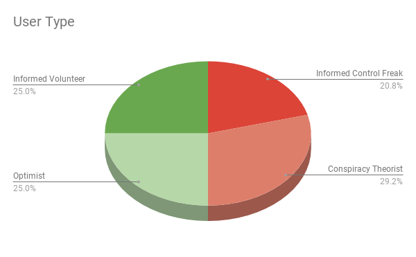
I found that about half of users normally allow anonymous usage statistics, and half do not. Those same users broke down into four roughly-even categories.
Informed Volunteer
25% clearly understood what information was being captured, that no personal information was collected, and they were happy to share those bits of statistical data to help improve the product.
Optimist
25% were not very clear about what information was being collected, but trusted that the data would be used in a benign way, or that they were powerless to stop it from being used in a malicious way.
Informed Control Freak
20.8% clearly understood what metrics were being collected, but did not want reports being sent over their network, creating extra traffic and consuming bandwidth. Several remarked that there was no incentive for them to participate.
Conspiracy Theorist
29.2% believed that anonymous usage statistics and crash reports would allow the company to have access to the content of their files, or that their personal information would be added to a spam mailing list. Many of these users commented that they did not want the government spying on them.
Additionally, I learned that users are more inclined to participate if they trust the company. Brand trust includes the company’s ability to deter data breaches by hackers.
Design improvement
(1 week) – Axure interactive prototype, UserTesting.com
The existing installation wizard only had an unchecked checkbox for the option to allow collection of anonymous usage statistics. This checkbox was easily ignored.
I redesigned the wizard to use an unfilled, required radio button choice to allow or decline anonymous usage statistics. This forces users to slow down and consciously pick one option or the other. In tests, this design performed twice as well as the existing wizard.
Result
Once deployed, this new wizard increased metrics opt-ins to about 20% of all installations.
Problem 2 – Out of Screen Real Estate
The legacy UI was not scalable, and it became unclear where to add new features.
- Confusing controls were spread across multiple tool bars, dialogs, and property sheets.
- Controls often had lengthy labels that became problematic in some languages.
- There was no established design system or pattern library.
- Accessibility was never considered, and navigating without a mouse was impossible.
Risks and Constraints
- Changing the existing user flow would mean legacy users would need to relearn the system.
- The monolithic legacy software was not very granular, so even small changes would be complicated to implement.
Setting Standards
(1 week) – Axure interactive prototype
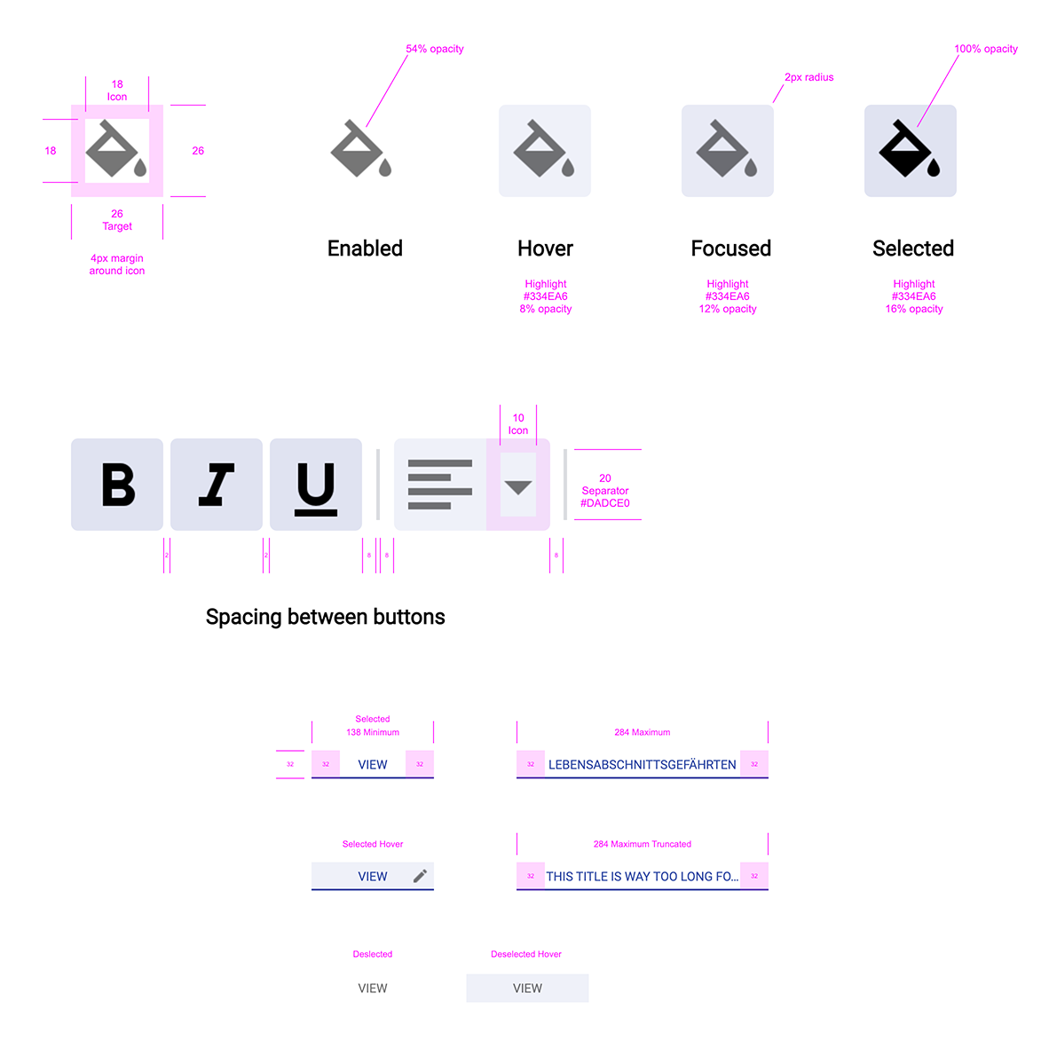
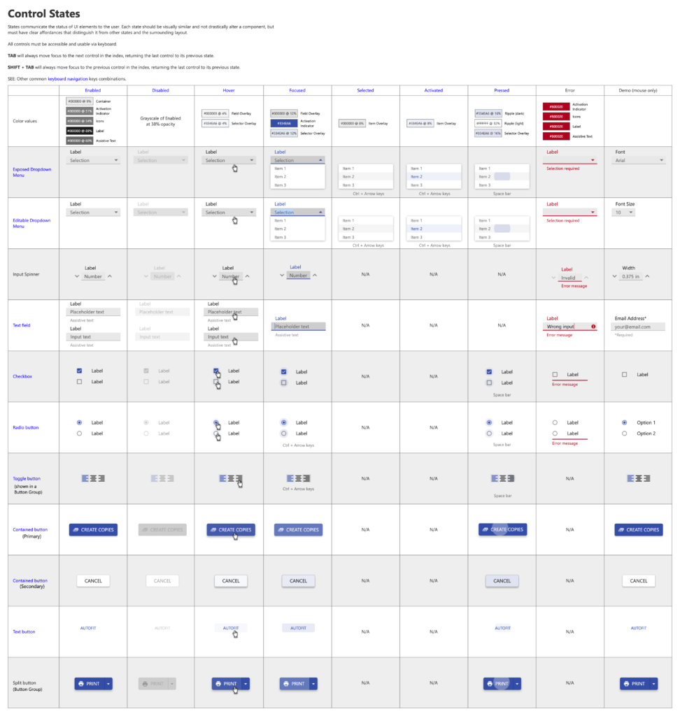
A design system was sorely needed for consistency and accessibility standards. Without time to create one from scratch, I adapted the Material design system.
I thoroughly documented specifications for each control, guiding developers in creating their first ever component library.
Design Improvements
Reorganized Property Sheet
(1 week) – Axure interactive prototype, UserTesting.com
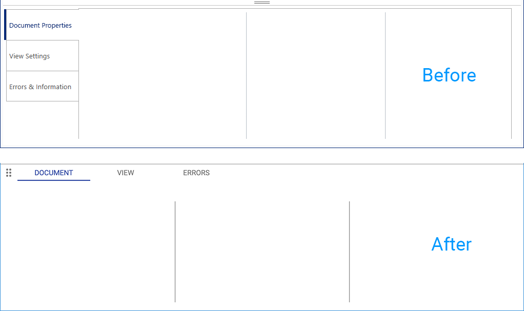
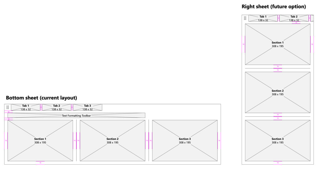
I reorganized the editor’s main property sheet to make better use of the available real estate and allow for future scalability. There was only room for 4 vertical tabs at any given time. I redesigned them as horizontal tabs, providing room for as many as 7, maximizing the width of the bottom property sheet.
I also reorganized all existing controls into a more logical information architecture, and laid them out in even sections that could easily be stacked vertically, if needed. This provided a future option where the property sheet could be docked on the side of the workspace, instead of across the bottom.
Iconic Toolbar
(1 week) – Axure interactive prototype, UserTesting.com
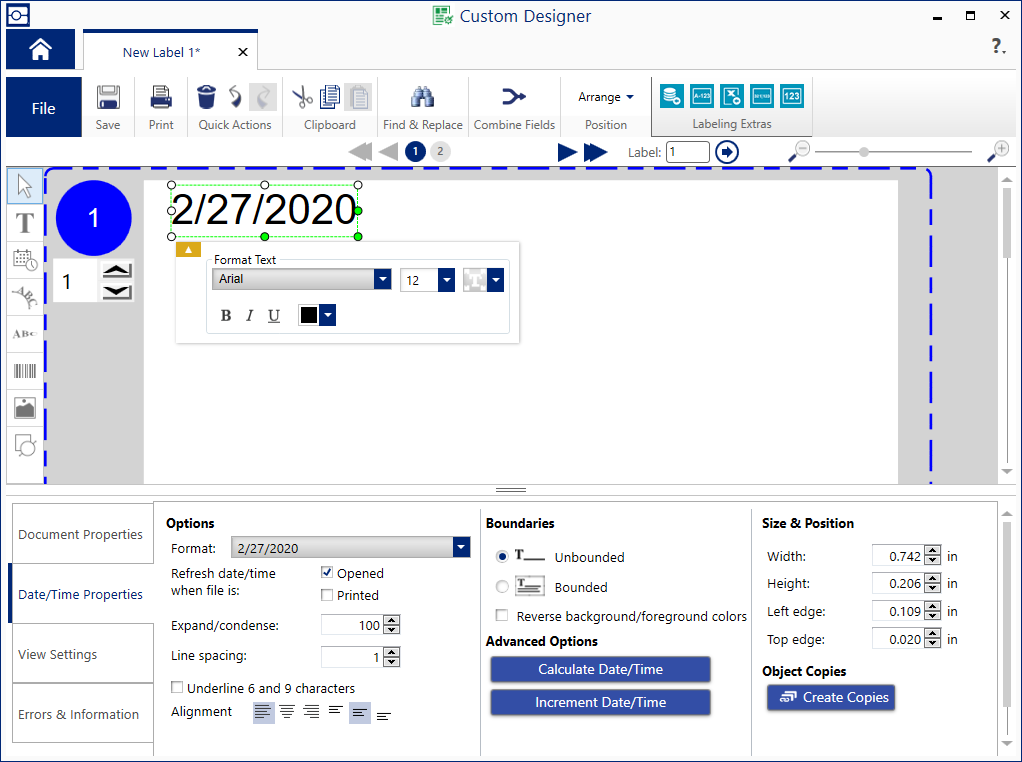
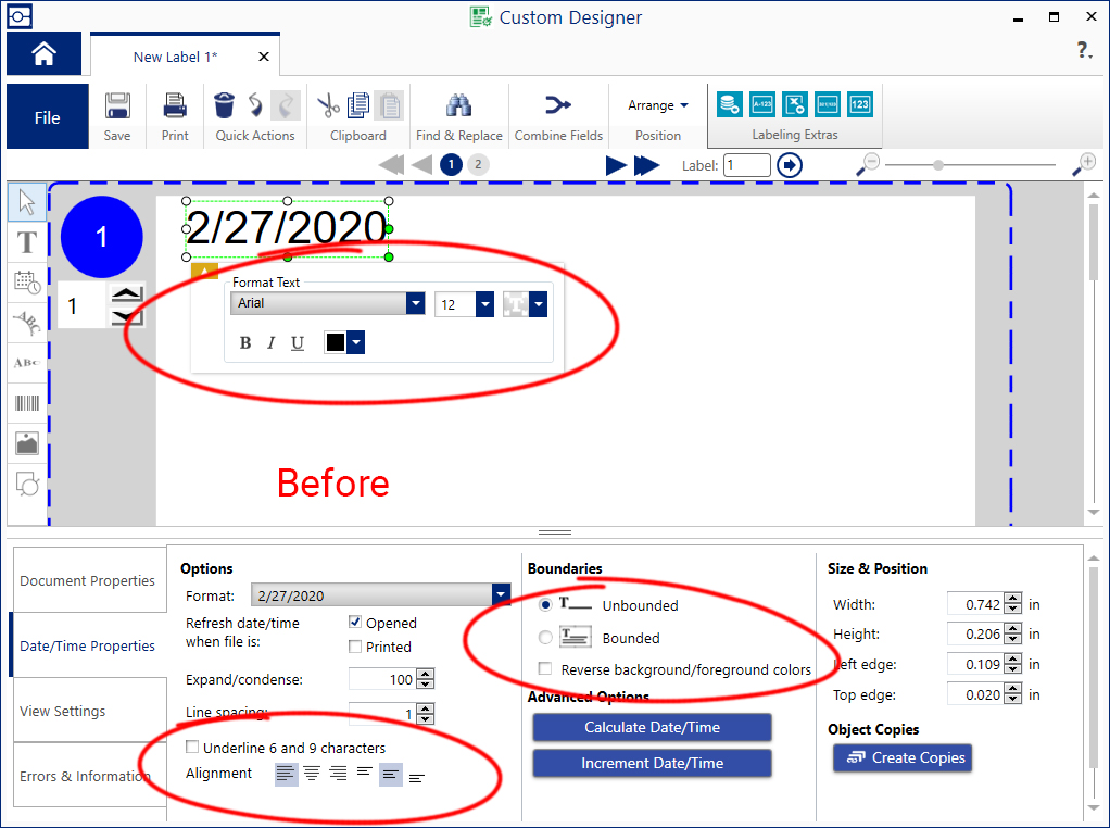
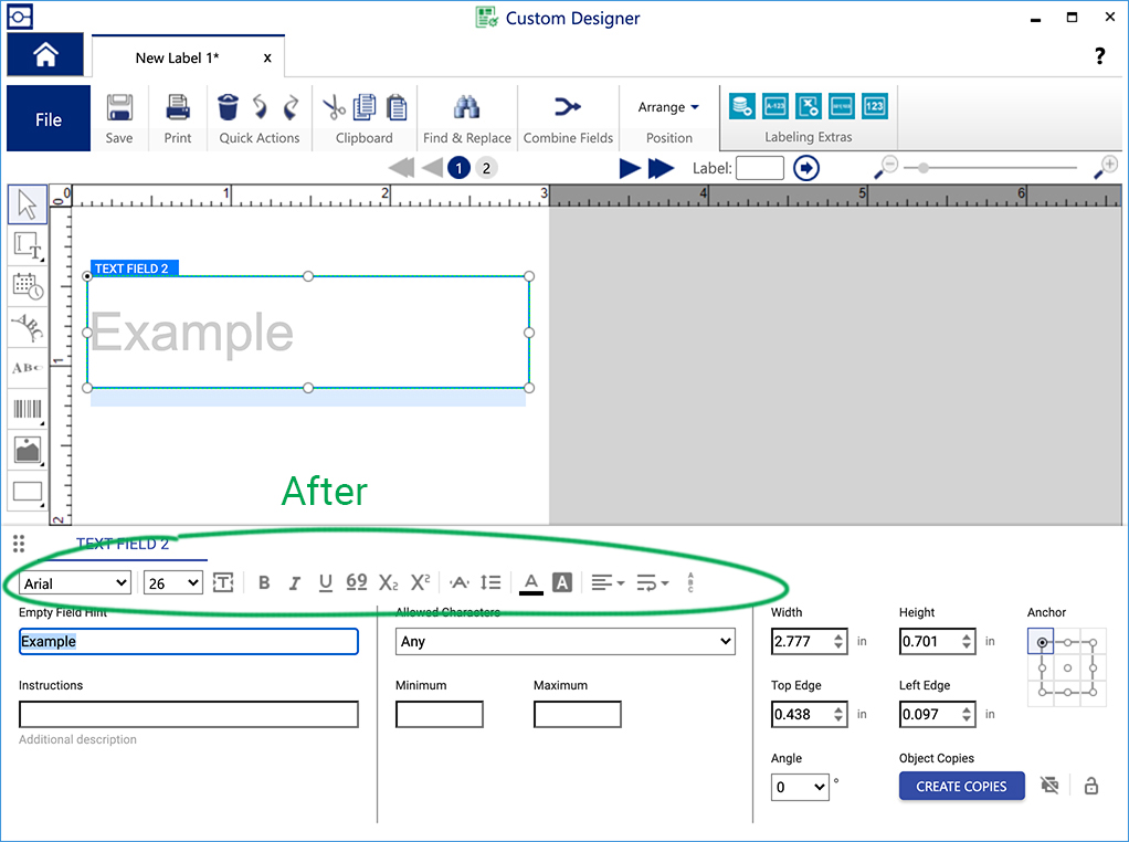
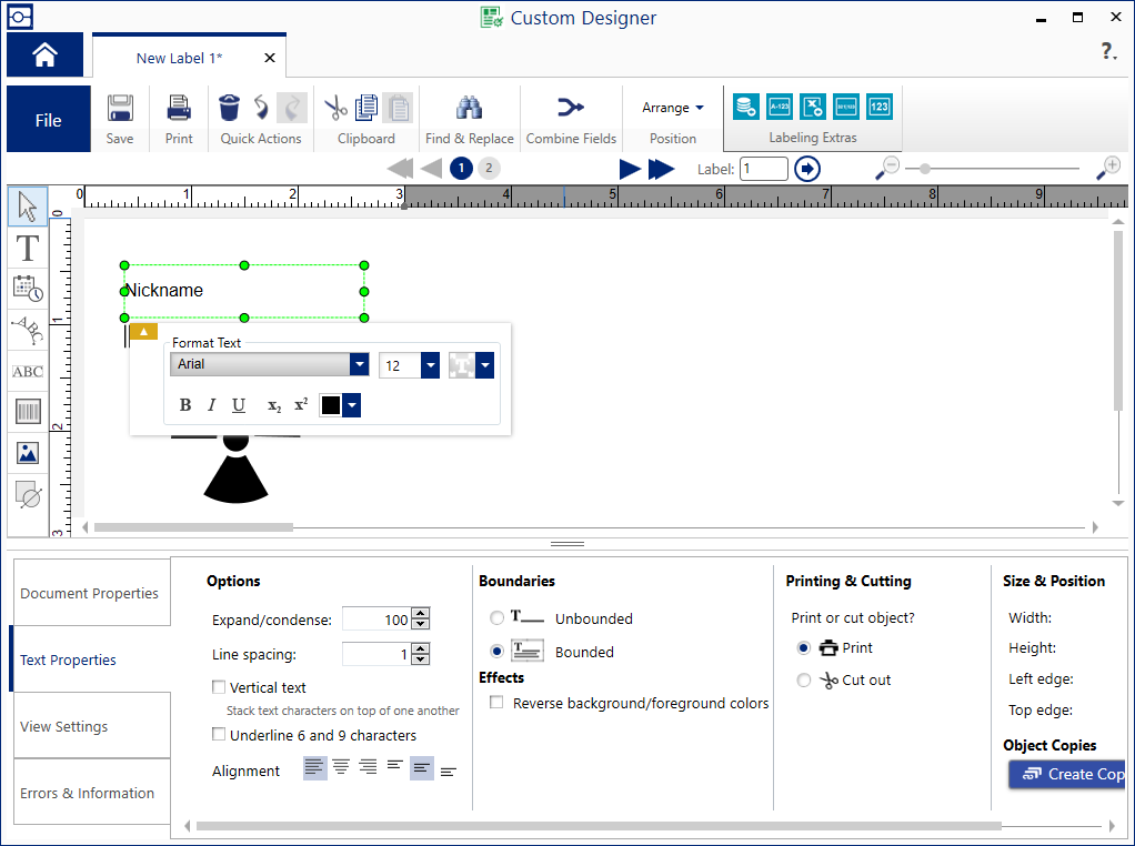
Some of the formatting controls appeared in a floating property window near the selected object. This was problematic because it was prone to obscuring other objects in the design. Also, most controls were named and had lengthy descriptions that used lots of UI real estate.
I eliminated the floating property window, and relocated all formatting controls to the bottom property sheet. I also replaced named controls with iconic ones to maximize real estate and minimize language translations.
Result
- Began implementing a design system to align with our other products.
- Logically grouped formatting controls, and eliminated unnecessary dialogs.
- Increased property sheet real estate and designed for future scalability.
- Introduced accessible design patterns for the first time.
Problem 3 – Misbehaving text editor
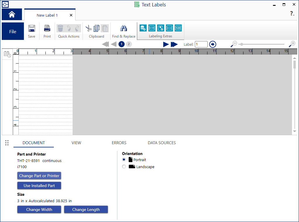
Users complained about this unintuitive interface, which looked like ruled notebook paper.
- Most users did not understand that font size determined the height of each row, and thereby the number of rows that would fit on a label.
- Some users wanted to set a fixed number of rows in their label before entering content.
- Other users wanted a flexible number of rows that would adjust while entering content.
- Keyboard navigation between rows and multiple labels was unpredictable.
Risks and Constraints
In order to support legacy users, we could not eliminate this format.
Design Improvement
(4 weeks) – Axure interactive prototype, UserTesting.com
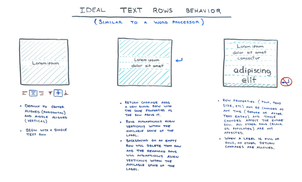
Users were expecting this interface to work like a word processor. I redesigned the editor to have similar behavior.
- Initially, only 1 line exists.
- Typing ENTER adds another row below the focused one.
- Typing BACKSPACE in an empty row removes it and focuses on the row above it.
Vertical alignment was a new challenge. Where a word processor typically adds content from the top down, labels are often designed so that content is centered vertically.
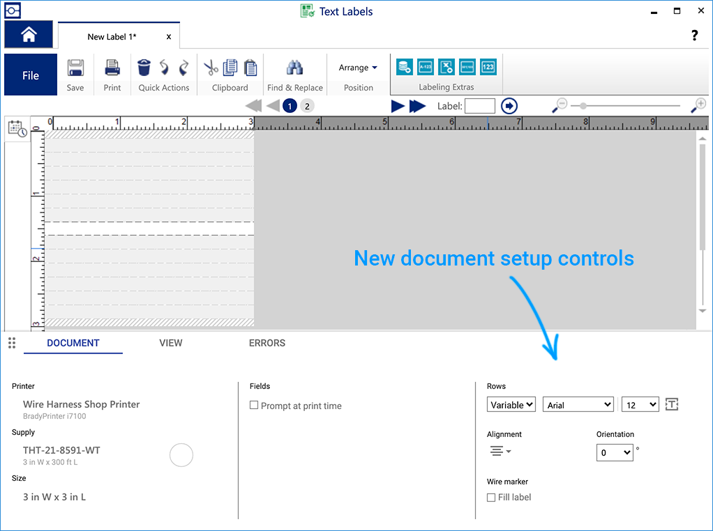
Optionally, I gave the user the option to set a fixed number of rows during document setup.
In case users disliked the hatching and dashed-line guides in the interface, I also gave them an option to hide them.
Through several UI iterations, this new behavior tested extremely well.
I worked with designers and developers to document the expected behavior in a variety of scenarios. Legacy files were fully supported.
Result
- Significantly improved text rows behavior.
- Tech support cases and user complaints about text rows decreased by 98%.
Problem 4 – Misunderstood Feature
Users wanted a way to make lots of labels with consistent formatting. Strangely, most users did not grasp the concept of using a template (in any software).
As a workaround, many users developed the habit of overwriting previous files with new content.
Furthermore, to prevent formatting changes, some of our customers were restricting software access to certain users.
One customer even resorted to locking up the computer hardware inside metal cabinets!

Visually, the template editor was nearly indistinguishable from the label editor.
Finally, there was no way to test a template without exiting the previous tools and re-opening the template file in a third editor.
Benchmarking
(1 week) – UserTesting.com
I ran a usability test on the existing design and user flow.
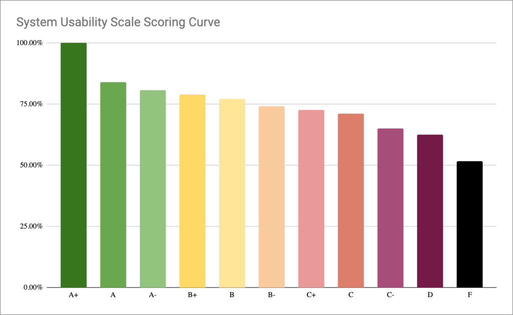
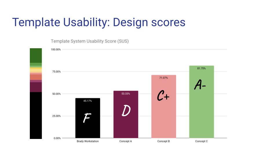
I had participants score the existing product using the System Usability Scale (SUS). I also developed a color-coded chart that converted the score into a letter grade.
Unsurprisingly, the existing design scored 45.17% (F).
Stakeholder Design Studio
(1 week) – Miro
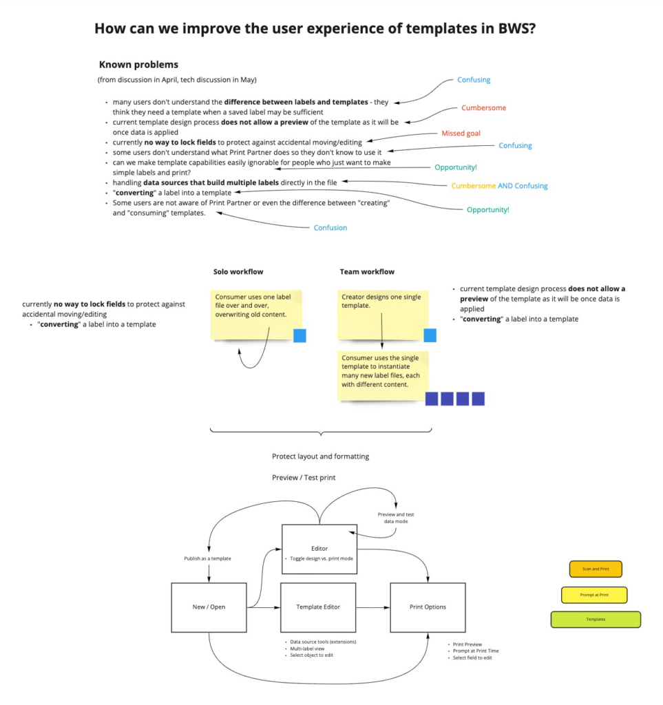
I organized a strategy session with product stakeholders, sales managers, and tech support managers. We determined that most users did not understand our product offering or its poor user experience.
Our solution was to redesign the system in such a way that templates and labels would become synonymous, in a unified editor experience.
Risks and Constraints
- Merging the existing behaviors of the template and label editors would mean a complex architecture.
- Merging the label and template editors would cause compatibility with legacy files.
- Merging the separate label and template editors products would cause software licenses to be restructured, and legacy licenses would need to be grandfathered into the new model.
Design Improvements
(9 weeks) – Axure interactive prototypes, UserTesting.com
I had to solve for 2 kinds of users: those working alone, or those working as part of a team. Templates could be used by either user type.
Concept A
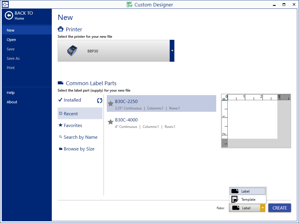
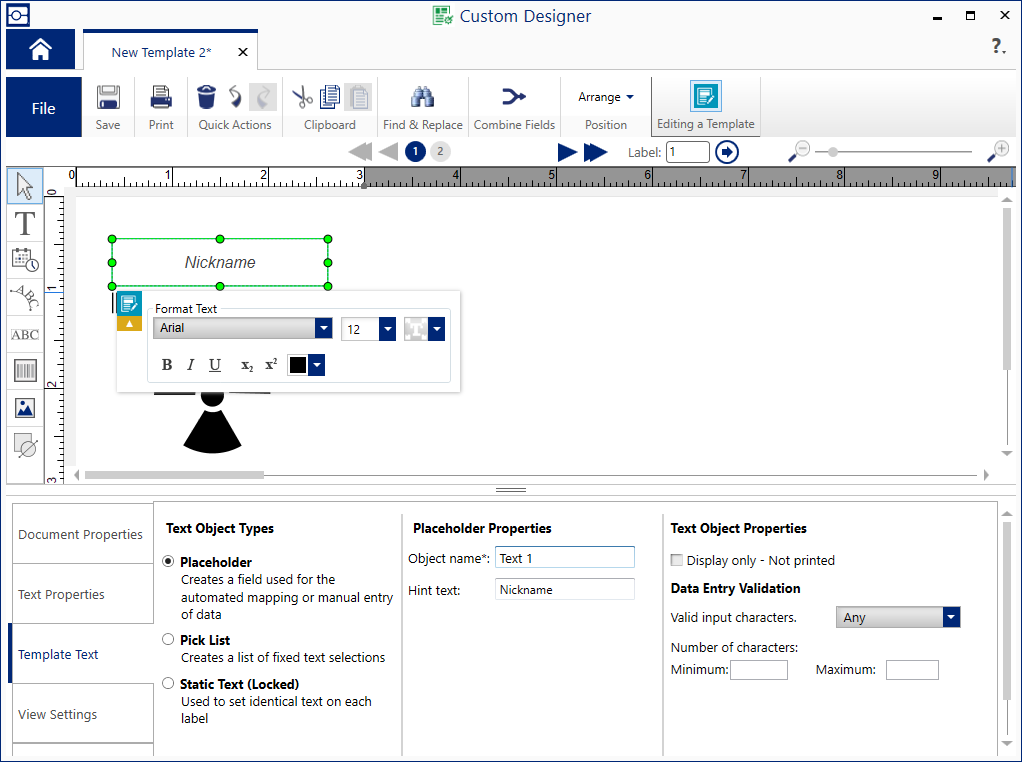
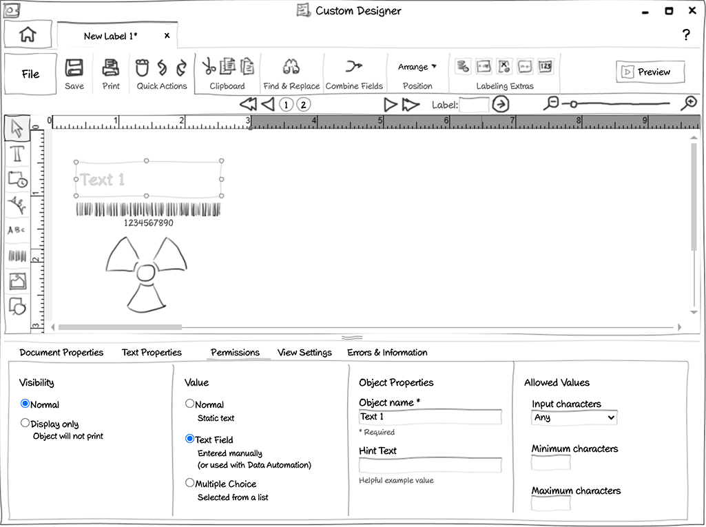
I made all template and label controls available in the same editor. The user could switch the behavior of an object by way of a “Permissions” tab.
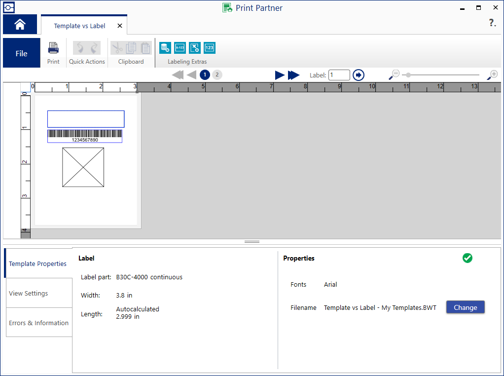
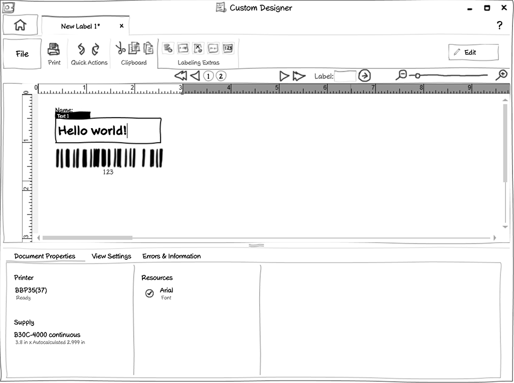
A user could test their template with sample data using a “Preview” mode.
The user also had the ability to Print from the Preview mode, and all of their test data would be printed, too.
On the SUS scale, Concept A scored 53.33% (D).
Concept B
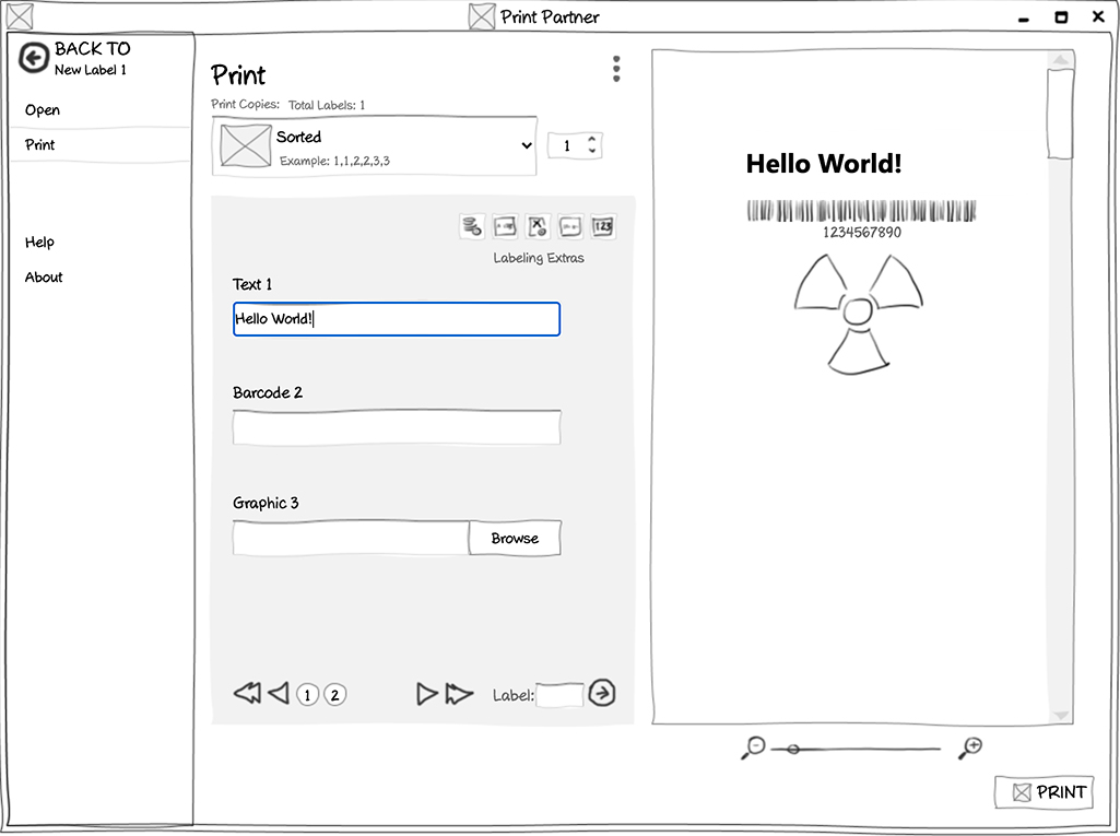
Same as Concept A, except the user could enter their test data directly on the Print screen.
Ultimately, both designs had similar problems:
- Drawing an object first and later changing its behavior through the “Permissions” tab was unintuitive.
- “Preview” mode looked too much like the regular Edit mode, and users had trouble understanding how to navigate between the two.
- Entering test data in a separate screen from the editor was unintuitive.
Concept C
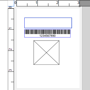
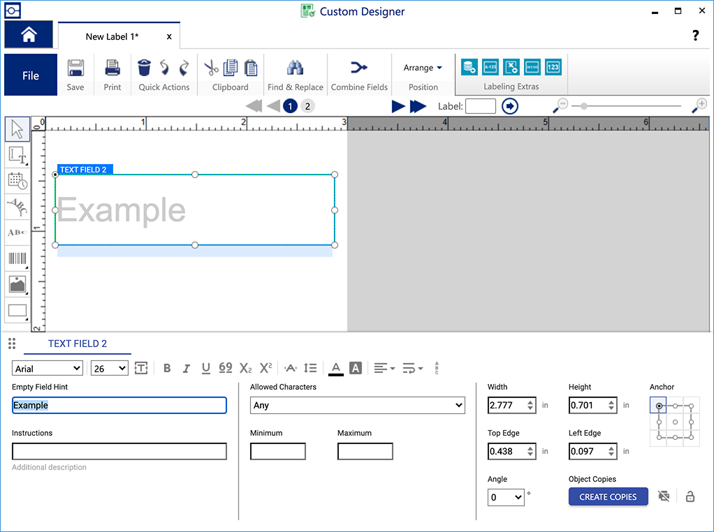
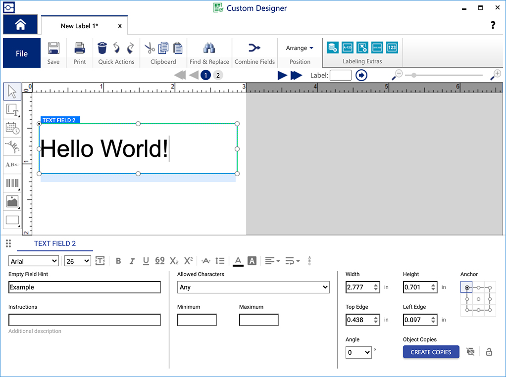
I tried a new, simpler user flow where the user picked the object type first, then drew the object, and formatted it last.
This way, I eliminated the “Permissions” tab by giving each object type each their own tool in the palette.
Final Product
Design Handoff
I provided the development team with assets, documentation, and ongoing support.
- Design documentation, including expected behavior and UI specs
- Graphical assets, such as icons or illustrations used in the product
- Terminology or copy used in the product
- Rapid design revisions to overcome unforeseen technical challenges
Result
- Users were able to begin building and using templates as intended, which increased usage and sales by 41%.
However, portions of the UI that were out of scope performed poorly, showing that more work is needed on this platform:
- When intending to use the File menu, many users inadvertently clicked the Home button instead.
- Users had trouble selecting the correct label supply when starting a new file, and spent upwards of 2 minutes on that operation.
- Users felt overwhelmed by the Save dialog that had too many options present.
- Users wanted to create new folders for every project, but the existing UI made it overly cumbersome.
- When formatting, most users instinctively looked for icons in the top toolbar, rather than the bottom property sheet.
What I Learned
- Complex legacy problems can yield some of the most creative solutions.
- Usability testing with sales people can be effective when actual customers are unavailable.
- Legacy users can be delighted by UI changes that are not intrusive to their learned behavior.


