

Design Ops
This project is part of a larger desktop software design epic.
(1 week)
Situation
This desktop software UI was not scalable, and it became unclear where to add new features.
- Confusing controls were spread across multiple tool bars, dialogs, and property sheets.
- Controls often had lengthy labels that became problematic in some languages.
- Accessibility was never considered, and navigating without a mouse was impossible.
- Changing the existing user flow would mean legacy users would need to relearn the system.
- The monolithic legacy software was not very granular, so even small changes would be complicated to implement.
Task
Reorganize the UI to make more screen real estate for additional features.
Action
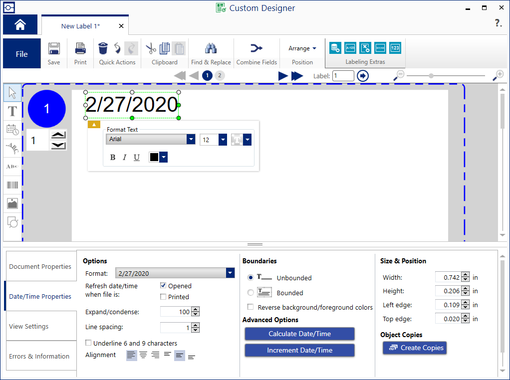
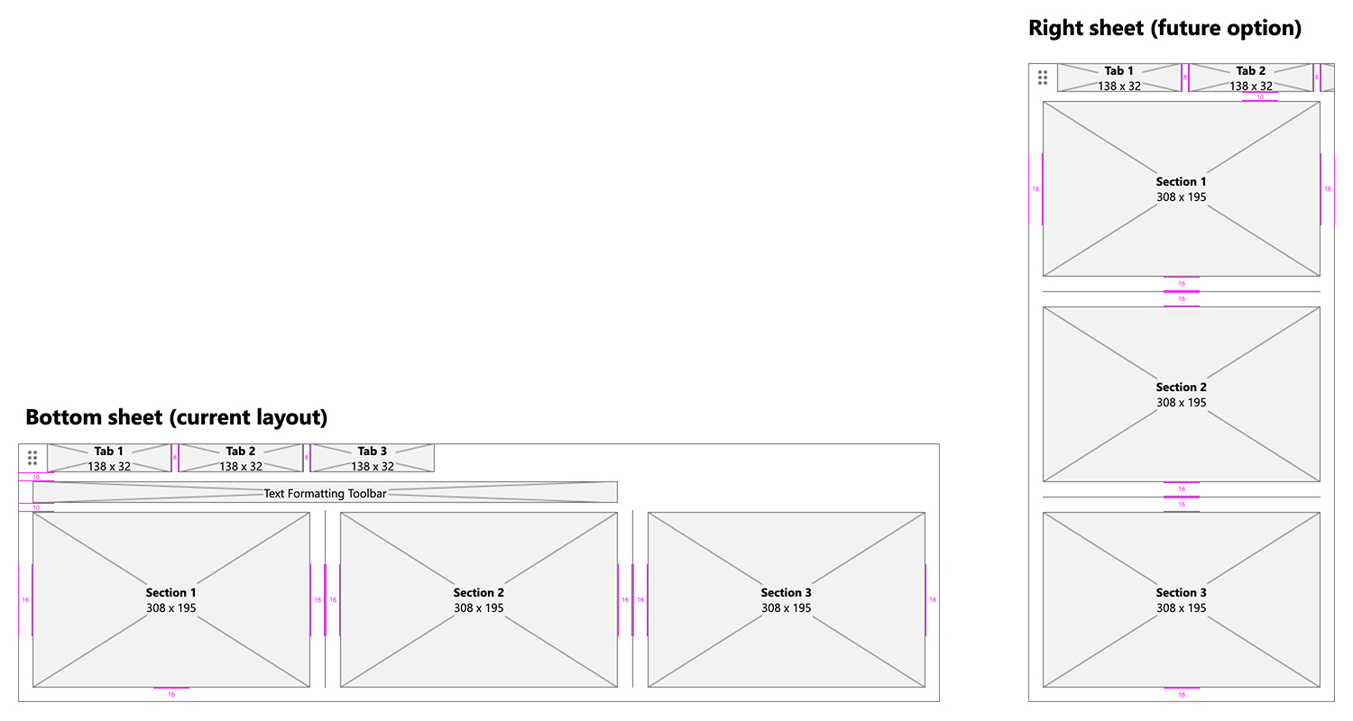
I reorganized the editor’s main property sheet to make better use of the available real estate and allow for future scalability. There was only room for 4 vertical tabs at any given time. I redesigned them as horizontal tabs, providing room for as many as 7, maximizing the width of the bottom property sheet.
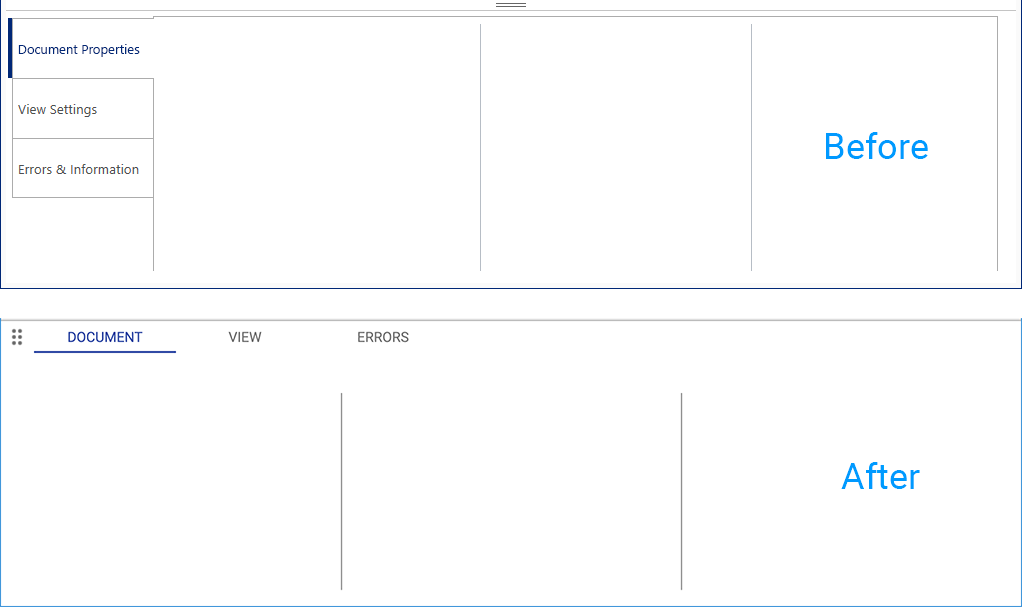
I also reorganized all existing controls into a more logical information architecture, and laid them out in even sections that could easily be stacked vertically, if needed. This provided a future option where the property sheet could be docked on the side of the workspace, instead of across the bottom.
I created Axure prototypes and validated them with usertesting.com.
Result
This software’s UI was reorganized to be more scalable for additional features, and more flexible for user customization.