
Design Ops
This project is part of a larger desktop software design epic.
(9 weeks)
Situation
Previous UX research showed that a template editor was unpopular because it was confusing. The software was primarily marketed by 3rd party vendors, so finding real end users for usability testing was unrealistic.
Task
- Combine the template editor and document editor into a unified experience.
- Support workflows for solo users or a team of users.
Action
First I recruited several test participants from in-house who had enough background knowledge to operate the legacy software, but were not experts. Then I created several prototypes in Axure and tested them against the in-house participants using usertesting.com.
Concept A
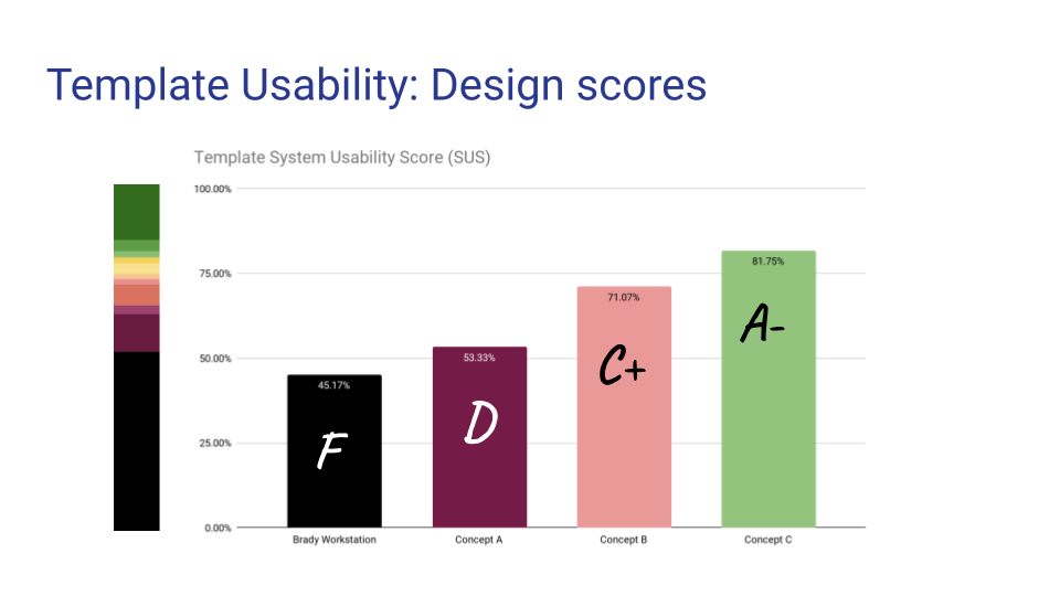
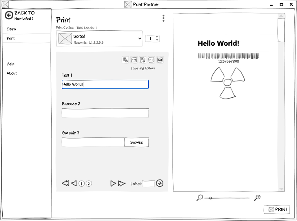
This design combined all of the template and document controls, but contained the experience in separate “modes”. The user could switch between designing and previewing a template. Only some usability testers discovered that templates could be populated in preview mode, and then printed using the Print Options screen. On the SUS scale, Concept A scored 53.33% (D).

Concept B
This design was the same as Concept A, except templates could also be populated on the Print Options screen. On the SUS scale, Concept B scored 71.07% (C+).

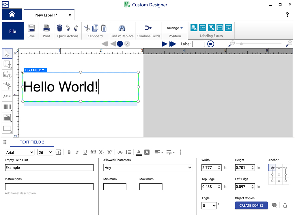
Concept C
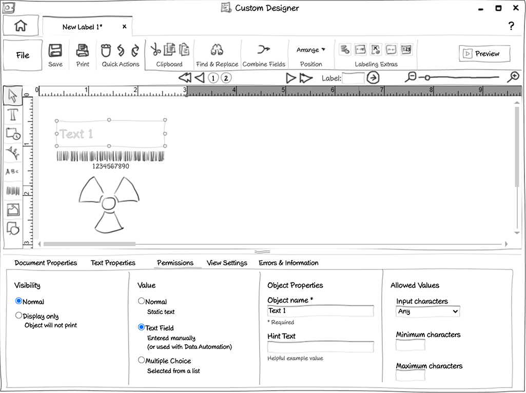
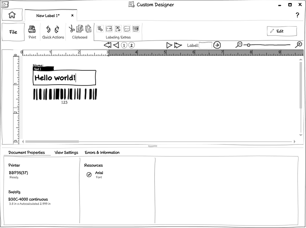
This design simplified the user flow by keeping both documents and templates in the same editor experience by combining both of their respective tool sets into the same tool palette.
I also eliminated the need for a separate test mode by allowing the user to type values directly into their newly created objects in a WYSIWYG fashion.
Concept C tested extremely well, scoring 81.75%(A-).


Result
Concept C was selected for development. When implemented, users were able to begin building and using templates as intended. Although the separate template editor was eliminated from the product catalog, usage and sales of the document editor increased by 41%.
Through this process I also learned that certain in-house employees can be a good proxy for actual usability testing participants.