

Design Ops
This project is part of a larger desktop software design epic.
(1 week)
Situation
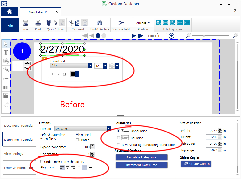
This design software has confusing formatting controls.
- Some controls appeared in a floating property window near the selected object.
- The floating window often obscured other objects behind it.
- Other controls appeared in a bottom property sheet, and were not grouped logically.
- Most controls had lengthy text descriptions that used a lot of UI real estate.
Task
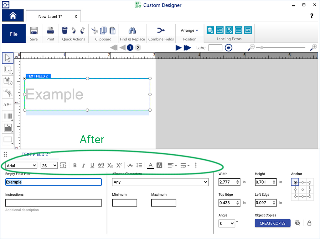
- Find a way to prevent objects from being obscured.
- Group related controls together.
Action
I eliminated the floating property window, and relocated all formatting controls to the bottom property sheet. I also replaced named controls with iconic ones to maximize real estate and minimize language translations. I created an Axure prototype and validated it with usertesting.com.
Result
Logically grouped controls were easier to navigate. Iconic controls saved screen real estate. Removing the unnecessary floating dialog kept all objects visible at all times.