Design Ops
This project is part of a larger desktop software design epic.
(2 weeks)
Situation
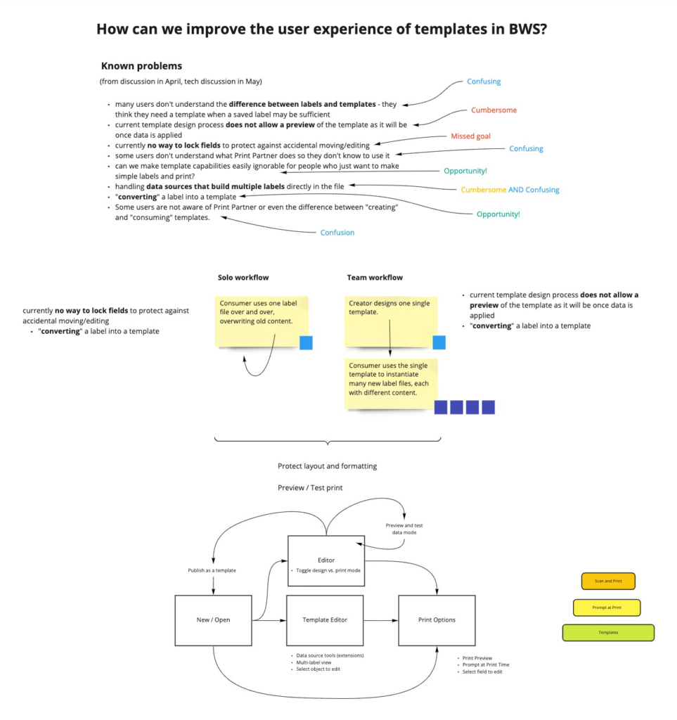
Users wanted a way to make lots of documents with consistent formatting. Strangely, most users did not grasp the concept of using a template (in any software).
- As a workaround, many users developed the habit of overwriting previous files with new content.
- Furthermore, to prevent formatting changes, some of our customers were restricting software access to certain users.

Task
Discover why the existing templates feature is not being used.
Action
First, I did heuristic analysis of the existing feature. I found that:
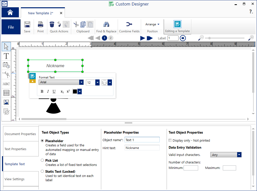
- The workflow for using the template editor was unnecessarily complex.
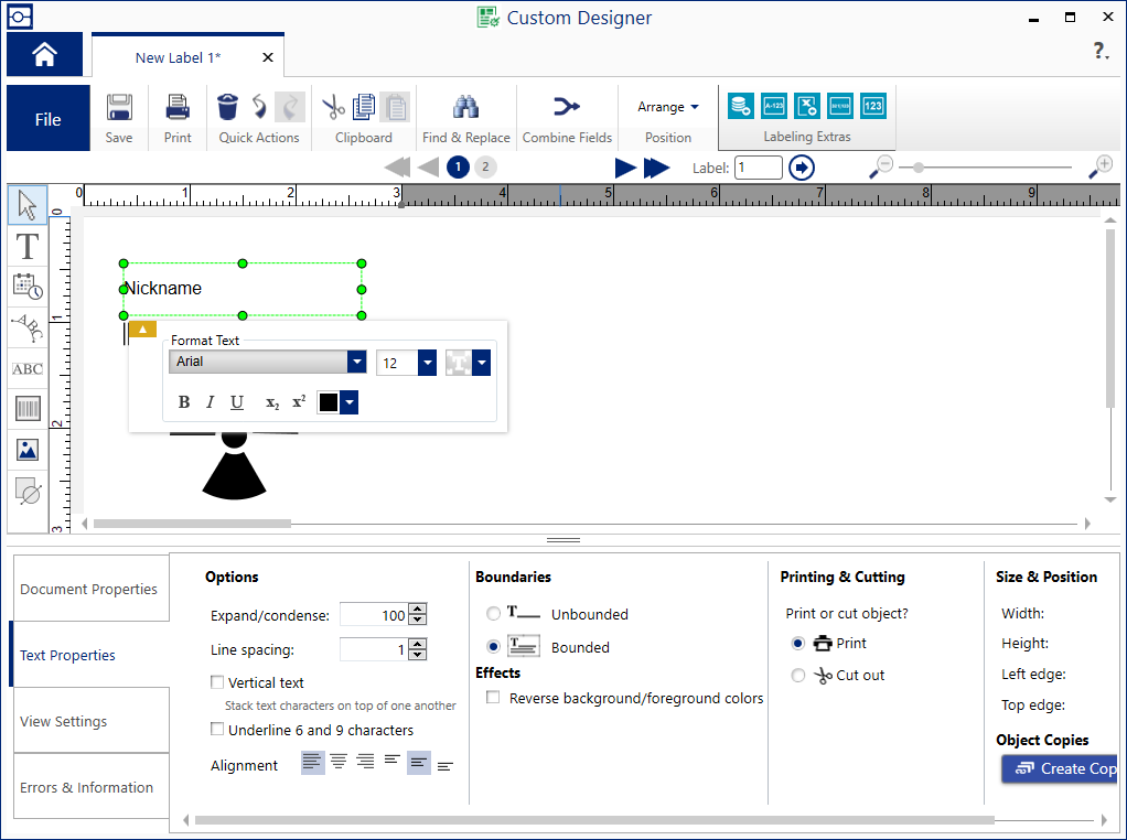
- The template editor was visually similar to the document editor.
- Template files had to be opened in a third editor to be used, and the UI was not intuitive.
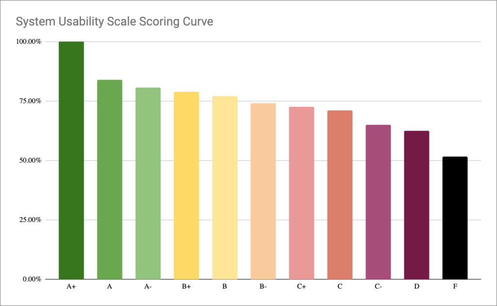
Then, I benchmarked the existing feature’s workflow with a usability test. I had participants score the existing product using the System Usability Scale (SUS). I also developed a color-coded chart that converted the score into a letter grade.
Unsurprisingly, the existing design scored 45.17% (F).
Result
I presented my findings in a stakeholder design studio. We determined:
- The existing template feature was unusable and unsalvageable.
- To fit the mental model of our users, the feature would have to redesigned such that documents and templates are synonymous.
- Any redesigned feature would need to accommodate workflows for both solo users and teams.
See my Document Editor Redesign case study for the final solution.

