Design Ops
This project is part of a larger desktop software design epic.
(4 weeks)
Situation
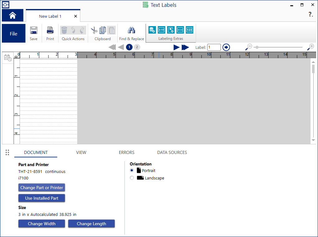
Users complained about this unintuitive text editor interface, which looked like ruled notebook paper.
- Most users did not understand that font size determined the height of each row, and thereby the number of rows that would fit on a document.
- Some users wanted to set a fixed number of rows in their document before entering content.
- Other users wanted a flexible number of rows that would adjust while entering content.
- Keyboard navigation between rows and multiple labels was unpredictable.
- In order to support legacy users, we could not eliminate this document format.
Task
Redesign the text editor behavior to be intuitive and consistent.
Action
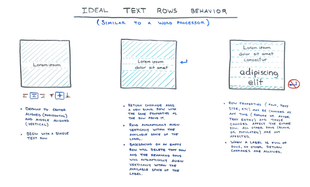
Users were expecting this interface to work like a word processor. I redesigned the editor to have similar behavior.
- Initially, only 1 line exists.
- Typing ENTER adds another row below the focused one.
- Typing BACKSPACE in an empty row removes it and focuses on the row above it.
Vertical alignment was a new challenge. Where a word processor typically adds content from the top down, labels are often designed so that content is centered vertically.
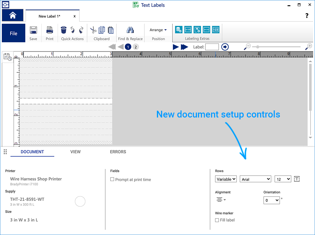
Optionally, I gave the user the option to set a fixed number of rows during document setup.
In case users disliked the hatching and dashed-line guides in the interface, I also gave them an option to hide them.
Result
Through several UI iterations in Axure, this new behavior tested extremely well in usertesting.com. The new controls were fit well into the existing editor and supported all legacy settings. Tech support cases and user complaints about this interface decreased by 98%.


