New Product Development
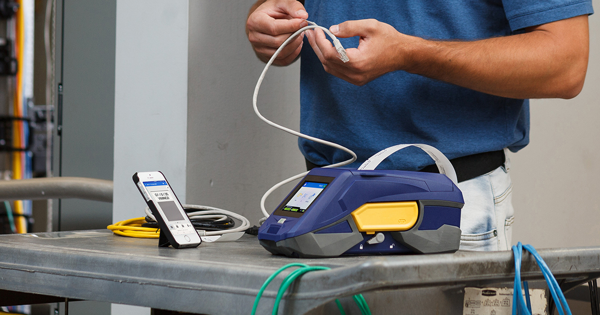
This project is part of a larger portable printer and mobile app epic.
(1 week)
Situation
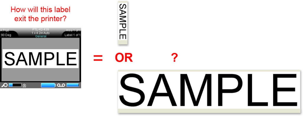
A series of label printers all used labels that came on a roll of tape. When designing the labels in an editor, it was unclear if the content would print ACROSS the width of the tape or ALONG the length of the tape. Although there was an affordance in the UI (a small string of text in the corner), users were often surprised when their labels would exit the printer at an unexpected size.
Task
Redesign the affordance so that users will clearly understand how their content is oriented on the label tape.
Action
Rather than replacing the existing affordance, I added a new illustration of the tape itself into the editor. I designed this visual language to describe the orientation of any shape, size, or type of label supply.
Result
Complaints about content rotation were eliminated. This new type of affordance was adopted across all platforms, including printer firmware, mobile apps, and desktop software.


