Label Editor App Design

A portable label printer and connected smartphone app sit on a work cart while a technician applies labels to a cable.

New Product Development

This project is part of a larger portable printer and mobile app epic.

(6 months)

Situation

A printer company wanted a way to design labels using a mobile app. Each label would have the option to include text, symbols, barcodes, images, and more. Additionally, this app would include several high-risk features that had never been included in previous mobile apps.

Task

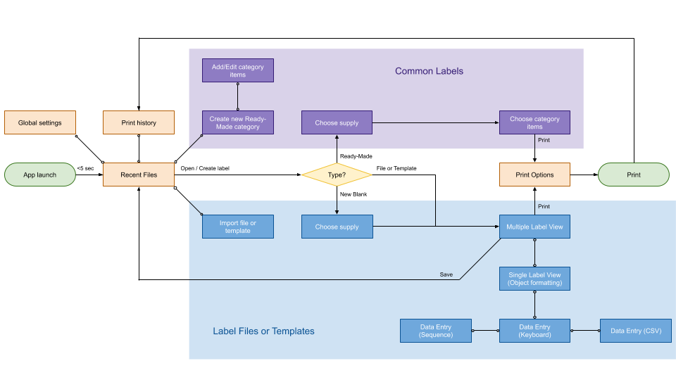
Design a mobile app with the following features:

  • A way to open existing label files (designed on a desktop program).
  • A way to print frequently-used labels without designing them from scratch.
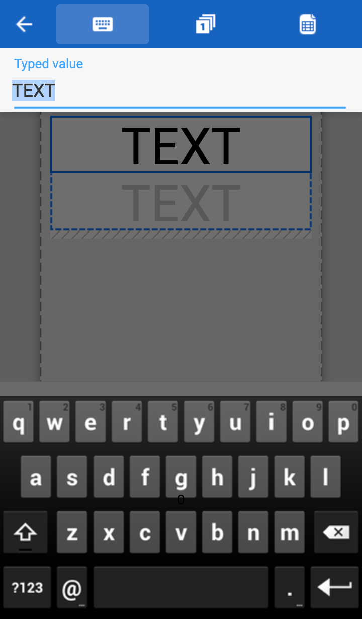
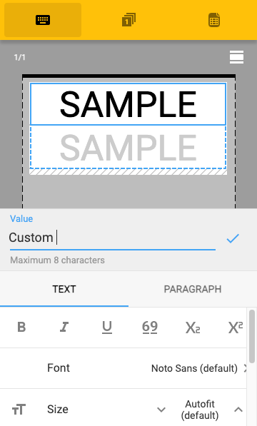
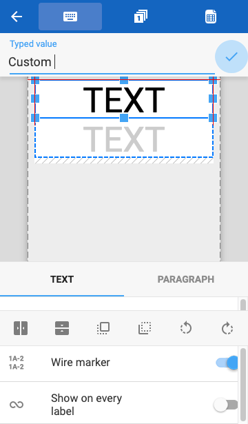
  • A way to design labels with manually entered text.
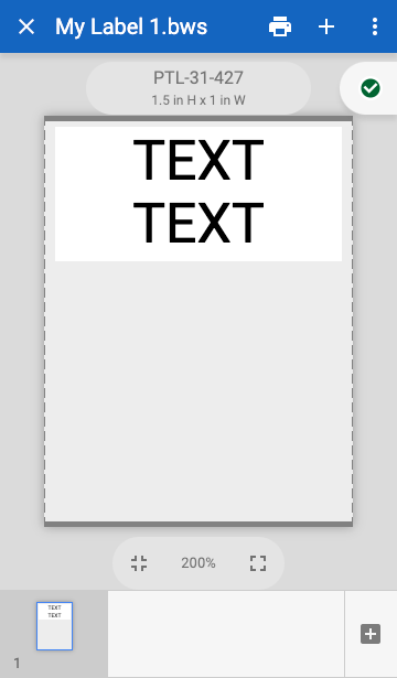
  • A way to design and view multiple labels in a set.
    • Labels with generated sequences of numbers
    • Labels with imported data
  • Must support dozens of languages.

Action

First I designed a user flow that would accommodate all of the required features. After sketching some rough ideas on a whiteboard, I mocked up a wireframe of the editor in Axure. Later, made the navigation into a prototype and tested it with usertesting.com.

High level user flow diagram of a label editing app, showing a series of steps beginning with the app launch and ending with printing.
High-level user flow diagram.
A label editor concept, showing the sample word TEXT on a label. A few controls along the bottom of the screen look like they are meant to add more objects or format the selected one.
Basic editor with a sample text object.
A label editor concept, showing a label with the word SAMPLE repeated twice. Icons for a keyboard, a sequence, and a spreadsheet are shown across the top of the screen. A text entry field is shown across the middle followed by a blue checkmark. The bottom property sheet has tabs for Text and Paragraph that contain a number of formatting controls, such as bold, italic, underline, font, and so on.
Editor with some formatting controls.

As the design evolved, I tested many iterations which included controls to:

  • add an object.
  • move an object or change its size.
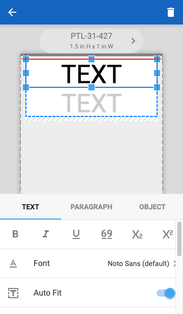
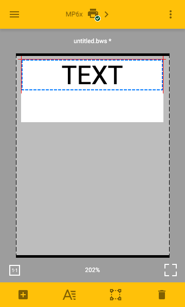
  • format an object.
  • edit content within an object.
  • populate an object with content from various data sources.
  • create specialty labels, such as wire markers.
  • intuitively navigate between many menus and property sheets.

A label editor concept, showing a label with the word TEXT repeated twice. The filename and some control icons are shown across the top. The label supply number and dimensions are shown, followed by a green checkmark. The bottom of the screen has a ribbon of label thumbnails, one for every label in the set.
Multi-label navigation was added across the bottom.
A label editor concept, showing a label with the word TEXT repeated twice. Icons for a keyboard, a sequence, and a spreadsheet are shown across the top of the screen. A text entry field is shown next, followed by a blue checkmark with pulsing blue halo. The bottom property sheet has tabs for Text and Paragraph that contain a number of positioning controls, such as align to center, bring to front, send to back, rotate left, rotate right, and so on.
Text entry field was moved to the top, well out of the way of the keyboard.

Result

To fully test all of the industry-specific features packed within this editor, the Axure prototype became extremely complex and fully functional, allowing users to experience creating documents, adding objects, modifying the formatting, generating multiple labels, saving their work, and importing existing files. When test participants used the prototype on a smartphone, many confused it for an actual mobile app. It was easily the most sophisticated prototype I have ever built.

  • 6 major iterations
  • 221 minor iterations

This thorough UX design effort saved thousands of development hours. Many of the assets from the prototype, such as icon files, were reused in the actual app.

Customers, QA testers, and Tech Support staff heavily gravitated towards this app, saying that it was a significantly better user experience than any other editor previously produced, including the company’s desktop software.

A label editor concept, showing a label with the word TEXT repeated twice. A Delete icon is shown at the top of the screen. The bottom property sheet has tabs for Text, Paragraph, and Object that contain a number of formatting controls, such as bold, italic, underline, font, and so on.
Property sheets were consolidated to simplify the user flow.
A label editor concept, showing a label with the word TEXT repeated twice, dimly visible behind a dark scrim. The smartphone keyboard fills the lower portion of the screen. Icons for a keyboard, a sequence, and a spreadsheet are shown across the top of the screen. A text entry field is shown next.
Users intuitively understood how to exit this text entry mode by tapping the modal scrim.